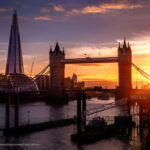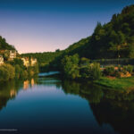
Every autumn, nature is transformed into a moving canvas where the light sculpts the colours like a living paintbrush. As photographers, we become the witnesses and interpreters of this fragile spectacle, somewhere between sensory reality and personal expression.
Photographing autumn isn't just about “capturing colours”, it's about interacting with the light, the weather and the time, and doing so through our own eyes.
The same landscape, seen by two people, will never be identical: perception varies, as does sensitivity. And it is precisely here that the magic of photography is born: in this blurred boundary between the world as it is and the world as we feel it.
In this new article, I invite you to delve into the art of photographing autumn colours, to understand how light shapes their intensity, how cameras translate tones differently, and how retouching, far from betraying nature, can on the contrary reveal its poetry.
Let's think how to reconcile fidelity to nature (reality) and artistic expression (interpretation), so that each image becomes a reflection of our own unique vision.
1. Understanding colour: light, pigments and perception
Before touching the settings, let's think about the basics of what's at stake in a cliché :
This difference between what the eye sees and what the camera captures is precisely the tipping point between reality and interpretation.
If we dig even deeper, biologically, each eye (and each brain) perceives colours in its own way: depending on age, the state of the lens, the distribution of cones (the cells sensitive to the wavelengths of our eye), certain deficiencies or even genetic differences (without going as far as colour blindness), there are variations in colour perception. And, believe it or not, this can be a creative advantage because everyone sees things differently, as a photographer why not capitalise on this uniqueness, The aim is to explore “personal” areas of colour, and give our images a colour signature that will speak differently to the viewer.
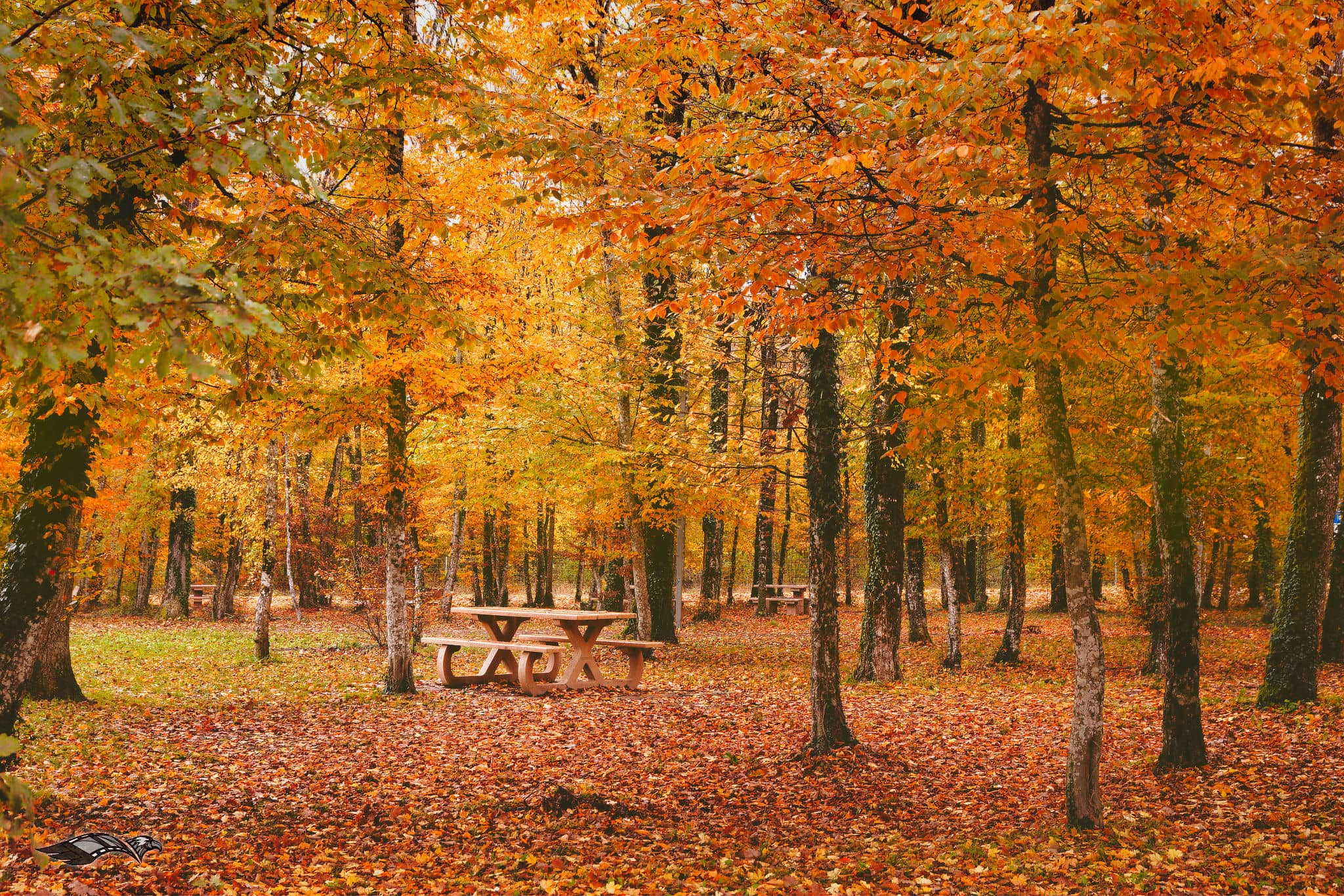
2. Capturing autumnal hues when you shoot
Choice of time
Gold, the colour of a “beautiful moment”, early morning or late afternoon, is an obvious choice. The light is softer, the shadows longer, the colours more saturated without being aggressive. The golden hour (just after getting up or just before going to bed) is often ideal for enhancing reds and ochres.
White balance, exposure, native saturation
Influence of the sky and weather conditions
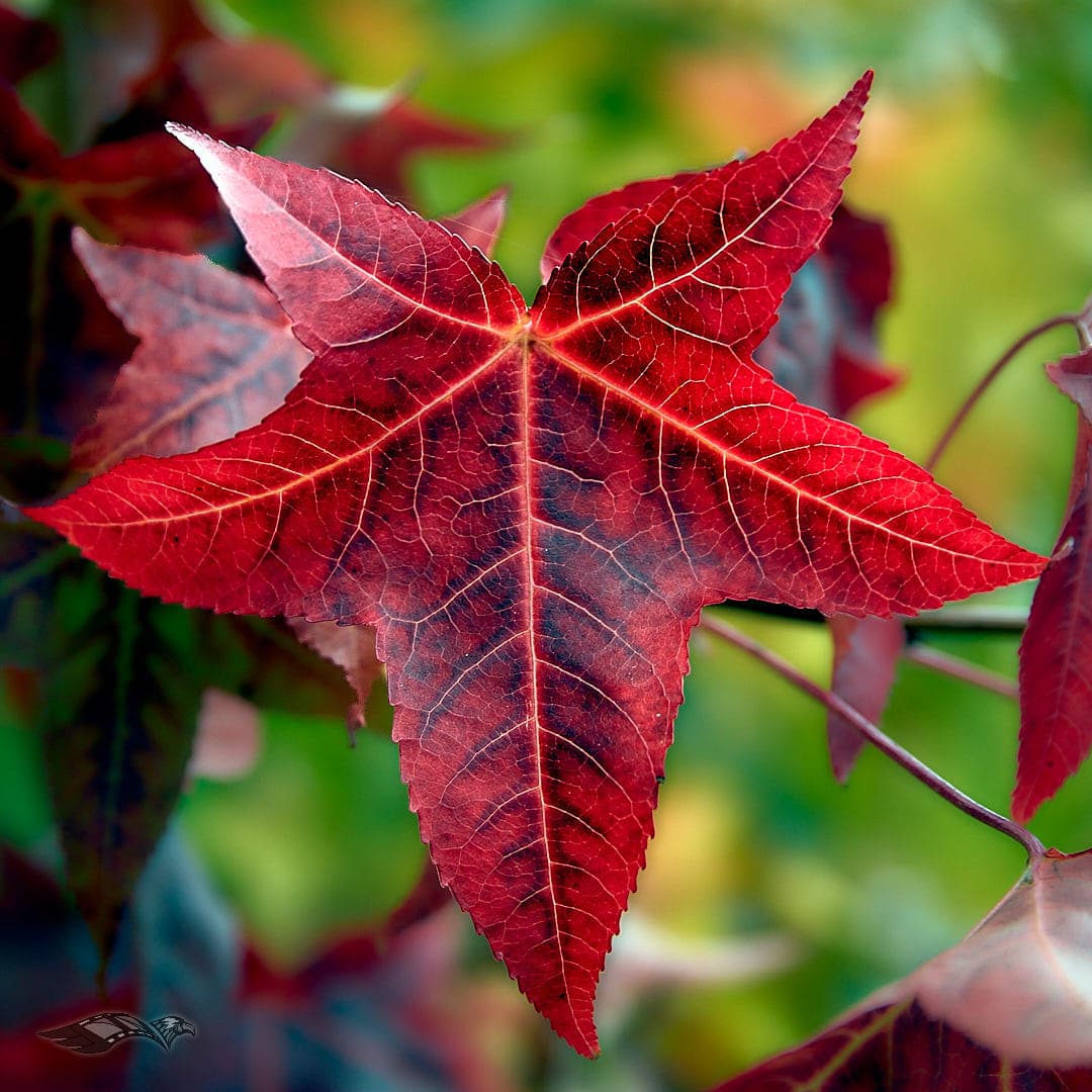
A uniformly grey sky diffuses the light and can “overpower” the autumn colours. On the other hand, after a downpour, a ray of sunshine breaks through the cloud veil, or an open clearing create good dramatic contrasts. Try to capture combinations; an isolated leaf bathed in a beam of light, in a chiaroscuro environment, or against a subdued forest backdrop... 🧐
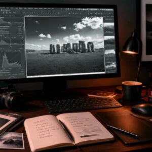
3. RAW conversion tools :
This is where each RAW converter reveals its “voice”. For example, one program may “pull” reds in a more magenta direction, another towards crimson. It's a good idea to compare colour renditions between these tools (Luminar, Capture One, Lightroom, Darktable, etc.). It all depends on what you're looking for, on what basis you want to start.
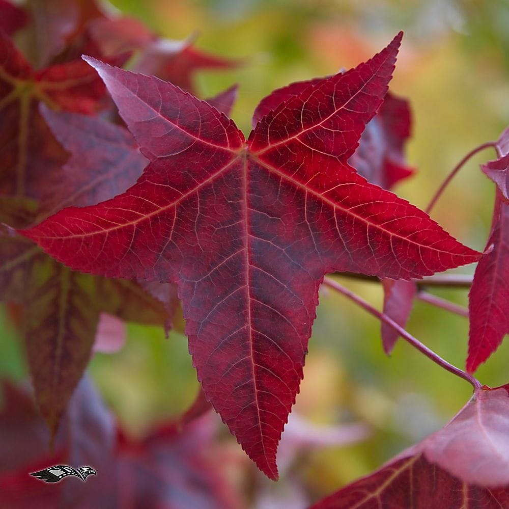
Preserving subtlety: avoiding over-saturation
This is the classic pitfall: pushing saturation to the point of visual exaggeration. To avoid this :
4. Interpretation in post-production
After conversion or RAW development, retouching is where interpretation comes into its own. Here's how it works, My vision is to achieve a subtle balance between creativity and respect for the environment.
Curves, tonality, tone layers
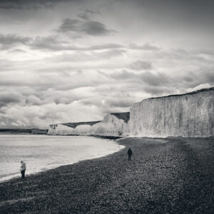
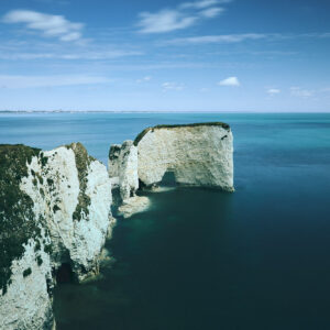
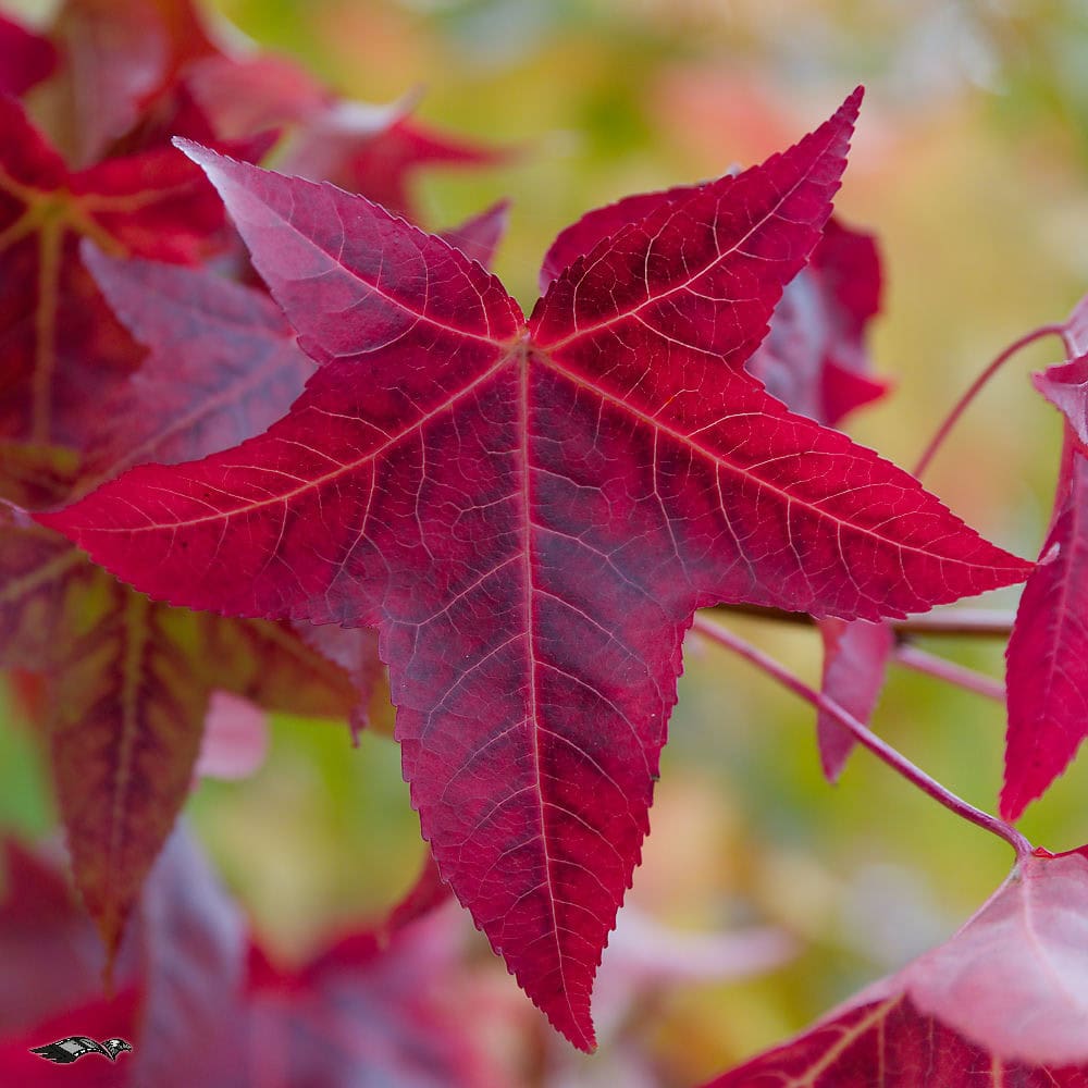
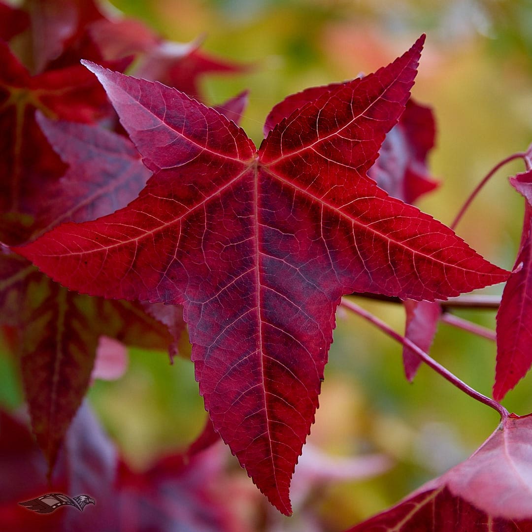
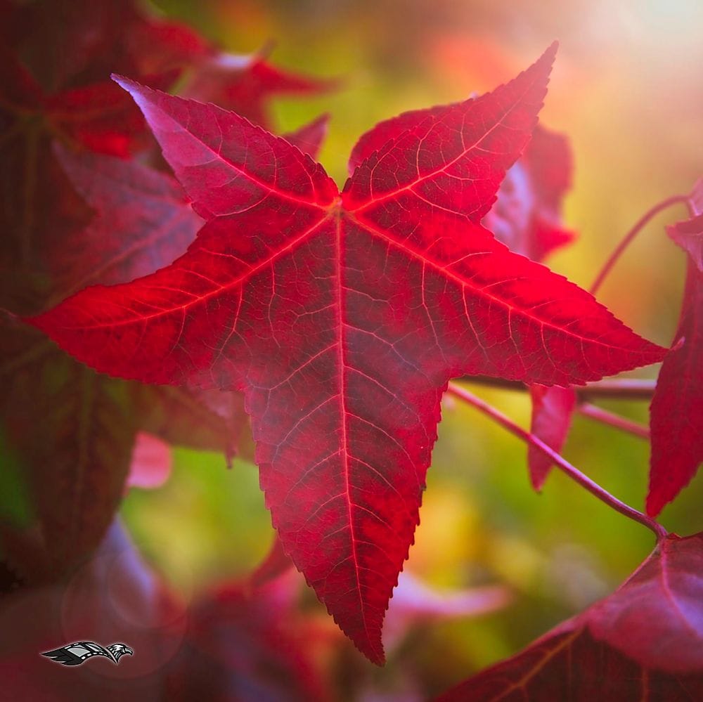
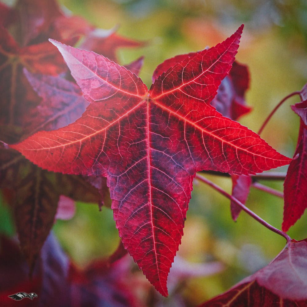
5. Case studies and visual examples
Below are a few examples of development carried out with different RAW conversion software, depending on what you want «creatively» speaking, the direction of development can be totally different, light, deep, contrasted or not, creative, meditative, a little of everything or none of that ... 😜
6. Tips for an adapted workflow
7. Conclusion
Autumn is a two-sided season: technical and poetic. For us photographers, it is an opportunity to capture its colours, requiring both rigour (light, white balance, exposure) and freedom (retouching, interpretation).
But what really matters is the way we look at things, as we saw above, whether literally or figuratively, we all have our own. What nature offers, combined with what we choose to show, is how we define our signature.
🍂 It's up to you! 😜, Test this workflow on your own autumn images and compare the renderings between different RAW converters. The colours are interesting and revealing in this test. You'll see just how unique each person's perception of colour is and how it influences the final result.
Don't hesitate to share your tests, your settings or even a before/after in the comments. Let's share our visions and talk about our creative visions, you can also visit my online galleries on www.dragonstreetphotography.com.
Thank you for reading and visiting and see you soon on Dragonstreet Photography,
David